Learning colour portrait tattooing: values, palettes and a painterly approach
Study colour portraits with paper or tablet exercises and compare painterly portraits, colour nanorealism and pet portrait training.

Learning colour portrait tattooing starts with four separate questions: what form are you representing, how light or dark is each area, what colour relationships are present, and where should the viewer look first? Buying more colours does not answer those questions by itself.
Masterink's Painterly Colour Portrait, Nano Realism in Colour and Micro Realism Pet Portrait in Colour explore different cases. This guide compares them and suggests paper or tablet drawing exercises. It does not give ink mixtures, machine settings or instructions for working on skin.
Value helps you check the face's volume
Value means how light or dark a colour appears. Different colours can have similar values. Separating facial areas only by hue can produce plenty of colour without a clear sense of volume.
Before adding detail, make a simplified greyscale version of your study. Check whether the head's orientation reads, the cheek turns towards shadow and the neck separates from the head. Return to colour and ask which decisions preserve those relationships. Use the comparison to think through the image, rather than letting a black-and-white filter make every decision.
Our realistic portrait guide explains an exercise using value groups if you need to work on light and shadow first.
Hue, saturation and temperature serve different purposes
Hue identifies the colour family; saturation describes its intensity. Temperature is a visual relationship: one colour may appear warmer or cooler beside another. Changing those relationships can help separate planes without making every colour compete.
The Painterly Colour Portrait syllabus includes design study, colour selection, ink palette, facial bases, colour layers and highlights. That sequence lets you examine how a palette relates to the full composition. It does not establish one “skin colour” formula or imply that every shadow needs the same cool tone.
What each specialism contributes
Painterly Colour Portrait develops a composition with a face, hair, decoration and fire. It suits the study of how palette, volume and supporting elements work together in a painterly reading of the whole image.
Nano Realism in Colour follows a small John Wick portrait integrated into a bust. Scale calls for selection: which features are essential, and which details should not compete? Here, “nano” describes the piece's approach, not a universal size standard or a beginner level.
Micro Realism Pet Portrait in Colour studies another subject: an animal's face, fur, eyes and clothing. Likeness depends on its structure and groupings of fur, rather than applying the same drawing used for a human face.
Review the full case taught in each syllabus. Choose according to the problem you want to understand, and confirm current availability and terms on the product page.
Exercise: one face, two palette decisions
Choose a reference you may use and draw two small versions with the same proportions and value groups. Work in pencil, paint or digital media; do not transfer this exercise to skin.
- In the first version, limit the palette to a few colour families. Note your light, middle and shadow colours. Study their relationships before seeking an exact match.
- In the second, keep the values and change only one area's temperature. Compare the separation between face and background.
- Reduce both to thumbnails. Does attention remain on the expression, or does an overly intense supporting colour attract the eye first?
- Desaturate copies to compare volume. If one loses its form, revisit values before adding eyelashes, pores or bright accents.
Write an observable conclusion. “The background has more contrast than the eye” is more useful than “the colour looks strange”. That wording also helps you request specific feedback.
Detail cannot replace a decision
A portrait can contain many details and still lose its likeness. Too many bright accents can spread attention throughout the image. Review proportions, values and hierarchy first, then decide which edge or accent needs definition.
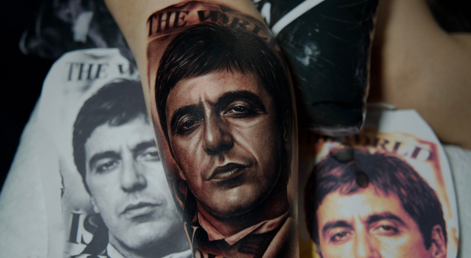
Scale matters too. An enlarged tablet view makes it easy to add information that disappears at presentation size. Alternate between those views. A photograph of a freshly finished tattoo records that moment; alone, it does not establish its healed appearance or promise the same outcome for another person.
Choose your next step
If you are just beginning with equipment, the beginner seminar covers the foundations. With an established base, compare design, palette and session lessons across specialisms. Watch the available free samples and check page language, audio and subtitles separately.
This Masterink guide uses the linked syllabuses and their preparation and analysis material. The drawing exercises are Masterink study suggestions. Artistic learning needs to be complemented by appropriate preparation and the health and professional requirements where you work.
Frequently asked questions
- What should I study before colour portrait tattooing?
- Proportions, light and dark values, colour relationships and composition. You can study these on paper or a tablet. Working on people requires separate preparation and supervision.
- Are painterly portraits and colour nanorealism the same course?
- No. Masterink’s painterly course studies composition, palette and the construction of a painterly portrait. Nano Realism in Colour focuses on a small piece and selecting information at that scale.
- Is there one universal mixture for skin tones?
- A recipe should not be treated as suitable for every portrait. References, lighting and colour relationships change. This guide studies those relationships through drawing, without skin application formulas.
Study a colour portrait step by step
Explore the Painterly Colour Portrait syllabus and how design, values and layers of colour are developed in a specific piece.