Learning realistic portrait tattooing: Black & Grey, opaque greys and practice
What to study for realistic portraits, how Black & Grey differs from opaque greys, and drawing exercises to help you choose a course.
Learning realistic portrait tattooing means bringing together likeness, values, edges and composition. Before choosing a course, identify what you need to resolve: preserving an expression, separating the face from its background, understanding shadows or adapting detail to the size of the piece. That decision is more useful than looking for a course that promises to cover every aspect of realism.
This guide organises a study path around Masterink syllabuses. Its exercises are for paper or a drawing tablet; they are neither instructions for working on skin nor an assessment of professional readiness.
Build foundations before specialising
The beginner tattoo seminar covers materials, machines, workstation preparation, lines, filling, shading and stencils, including a portrait session on practice skin. A specialist masterclass addresses a narrower problem and does not replace those foundations.
You can study portrait drawing alongside them: proportions, silhouette and groups of light and shadow. Our guide to starting from scratch explains the broader learning path. No number of months or drawings, on its own, qualifies you to tattoo people.
Black & Grey and opaque greys: what changes?
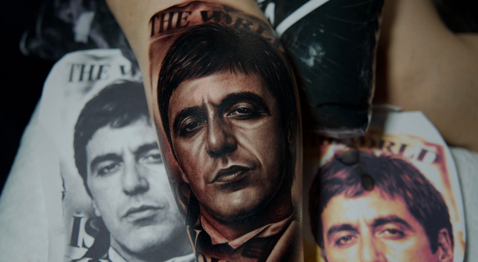
Black & Grey is a broad description. In Masterink's Realistic Black & Grey Portrait masterclass, Charly Ávila develops a Tony Montana portrait using diluted black. Design analysis, the hierarchy of planes and value construction connect throughout the syllabus. The face remains the focus beside the parchment, lettering and background.
Micro Realism in Opaque Greys studies a grey palette, scale, likeness and transitions between areas. “Opaque” describes a pigment property; it does not mean the whole image should look darker. “Grey wash” is not an automatic synonym for opaque greys.
Sculpture in Opaque Greys presents a different visual problem: representing volume and changes of plane from a sculptural reference. Distinguish the subject from the colour process. Two monochrome works may call for different decisions.
Review likeness, volume and edges separately
To review likeness, compare the relationships between eyes, nose and mouth, the head's tilt and its silhouette. Adding pores cannot fix a misplaced eye. To review volume, ask whether light, middle and dark groups explain the form without relying on small details.
Then review edges. When everything is equally defined, hair, background and decoration can compete with the expression. The Tony Montana syllabus distinguishes the portrait's foreground from its supporting elements. This is a composition decision, not a universal instruction to darken everything around a face.
Our reference-reading guide covers choosing and analysing the photograph. Here, that reading helps decide what to practise and which course addresses the difficulty.
A drawing exercise to identify your next step
- Choose a reference you may use and make two studies at the same size. Keep the first to three groups: light, middle and dark. Leave out fine detail.
- Keep those groups in the second study and define only the main relationships between eyes, nose and mouth. Check whether likeness improves or you have merely added information without correcting proportions.
- View both at presentation size and as thumbnails. Note where readability breaks down: outline, expression, background separation or transitions between planes.
- Repeat one area while changing one decision. For example, reduce background contrast while preserving the face. Write down what changes and what still does not work.
If the expression disappears in the thumbnail, making the design even smaller for microrealism will not solve that problem. Scale requires selection: details visible when enlarged may not help a small composition.
Match your course to the exercise
Look for a relevant lesson and check that the instructor explains the decisions. For hierarchy with diluted black, examine Black & Grey. For a monochrome palette and small portraits, compare Micro Realism in Opaque Greys. For sculptural volume, explore Sculpture.
Before buying, check requirements, content, audio and subtitle languages, access and current terms on the product page. This page's language does not prove that every lesson has that audio track. The free lessons offer a sample of the available teaching format.
For colour work, continue with our colour portrait guide. For help interpreting practice results, use the guide to requesting useful feedback. Choose a next step that addresses a specific difficulty without expecting a result identical to the instructor's.
Sources and scope
This Masterink guide draws on the linked syllabuses: design and planes in Black & Grey; scale and greys in Micro Realism; design analysis in Sculpture. The drawing exercises are Masterink study suggestions for comparing decisions before choosing a specialism.
Frequently asked questions
- Where should I start learning realistic portrait tattooing?
- If you are a beginner, start with foundations, drawing and supervised training. If you already tattoo, identify whether your difficulty concerns likeness, values, edges or scale before choosing a specialism.
- Are Black & Grey and opaque greys the same?
- Black & Grey describes a broad black-and-grey appearance. The Masterink course with that name uses diluted black; the opaque grey courses study a grey palette with different properties. Compare the syllabus and the actual demonstration.
- Is microrealism easier for beginners?
- A small piece requires careful selection of the information that remains readable. Small size does not mean lower difficulty or replace foundational training.
Study the process behind a Black & Grey portrait
Explore the realistic portrait course and connect your study of values, transitions and detail with a session explained by Charly Ávila.