
How to read a reference photo for a realism tattoo
Learn to read values, preserve likeness and decide what belongs in a portrait stencil. Includes drawing exercises and a reference review worksheet.
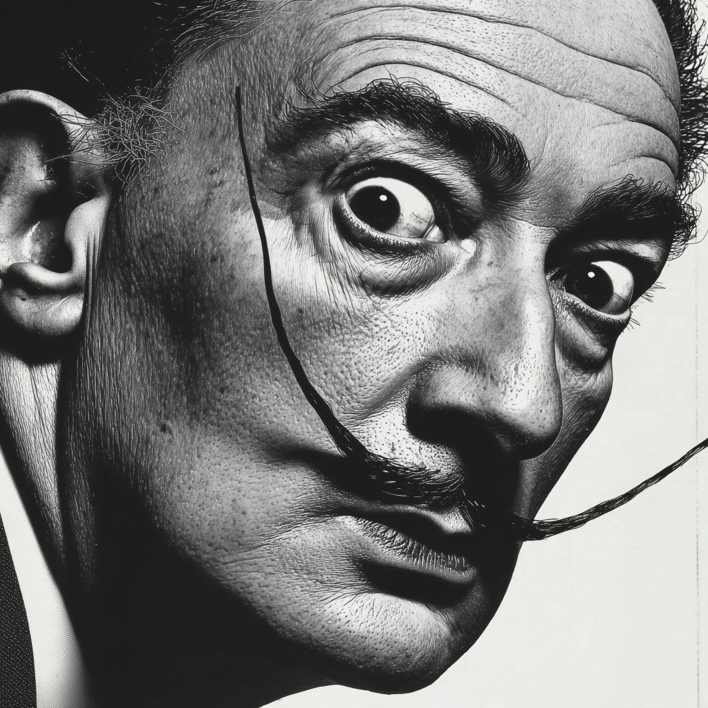
You have the photograph enlarged, a stencil packed with marks and several supporting images open beside it. Yet when you start drawing the cheek, you cannot decide how dark it should be or where the shadow ends. The difficulty may begin before technique: you have found the details without deciding what they do.
A reference for a realism tattoo should help you answer specific questions: where the form turns, what preserves the likeness and what must remain readable when the design gets smaller. This guide offers a way to study it on paper or a tablet before preparing the work. You do not need a tattoo machine for these exercises.
Give the main reference and supporting photos different jobs
Start with what the client wants to preserve. In a family portrait, that might be an expression, a particular age or a familiar look. Consider that alongside sharpness and lighting. The most striking photograph does not necessarily represent the person best.
Choose one main reference to establish the angle, proportions and direction of light. Other photographs can clarify a feature, but their parts are not interchangeable. A front-facing nose placed in a three-quarter face can produce something that looks plausible in sections and strange as a whole.
Ask for the original file if you only have a compressed screenshot. When information is missing, note it before drawing as though you know it. Detail reconstructed by an enhancement tool does not confirm that person's anatomy. Use your own images or obtain permission, and keep the original separate from edited versions.
First reading: what makes this face recognisable?
Before zooming in on pores, look at the relationship between eyes, nose, mouth and jaw. Notice angles, distances and asymmetries. A slightly raised corner of the mouth may matter more to likeness than many carefully copied eyelashes.
On a separate layer, mark the face's axis and the angles of the eyes and mouth. Compare those relationships with the photograph. You are not straightening the subject or imposing an ideal face. You are checking whether your drawing changes something the reference makes clear.
Now cover the small textures. If the portrait loses its identity, review proportions and large shapes before adding detail. This separates a structural question from a finishing question and gives you something specific to correct.
Second reading: organise light, middle and dark values
Value describes how light or dark an area is. Make a greyscale copy and a small version of the image. Locate the main dark masses, the areas sitting between light and dark, and the places where you need to preserve light.
Begin with three value families rather than an endless list of shades. You can subdivide them later. If every wrinkle is distinct but the cheekbone and cheek read as one surface, you may have solved small variations without establishing the larger relationship that contains them.
Draw those masses without gradients. Can you explain the face's orientation from this simplified study? If not, return to the photograph. Perhaps the lighting is flat, a filter has removed transitions, or you have grouped areas that perform different roles.
A dark patch does not explain a shadow by itself
Imagine a cheek covered by a beard. The photograph contains facial volume, cast shadows and hair texture at the same time. Treating all the dark marks as equivalent can leave you with a detailed beard sitting on a flat cheek.
On paper, identify which changes of value describe volume and which belong to texture. Examine edges too: where does one area clearly separate from another, and where does it gradually disappear into it? Avoid turning every visible boundary into a hard outline simply because it is easier to trace.
You do not have to identify everything immediately. A note such as “I cannot tell whether this is the shadow ending or the beard beginning” is useful. It locates a question a teacher can address more precisely than “I cannot do realism.”
Decide what deserves a stencil mark
A stencil needs a system you can interpret. For this drawing exercise, divide marks into three groups: positional landmarks, boundaries of important masses and details essential to likeness. Decide how to distinguish them in your study copy and write a key beside it.
Try removing a mark. If you lose an important landmark, it has a job. If removing it only reduces clutter without affecting your orientation, you may not need that detail. More lines do not automatically mean better preparation.
Keep the photograph available. A tracing can show where an eyebrow sits without explaining how dark it is relative to the eye socket. Store the original, value map and study stencil together because each answers a different question. This exercise does not replace the preparation and supervision required for working on skin.
Choosing greys begins with relationships
During design, replace “Which grey goes here?” with two questions: “Is this lighter or darker than its neighbour?” and “What separation does it need to maintain?” You can record these relationships before selecting a material or mixture.
Create five value swatches with a pencil or on your tablet. Use them to make a simplified portrait and check whether background, hair and face remain distinct. This is a reading exercise, not an ink recipe. Translating a drawing into execution involves more than copying a number from a screen.
If you are studying opaque greys, the guide to building volume explores that context. Keep the purpose of each exercise clear: evaluating design, interpreting the reference or reviewing execution.
Compare two photographs through one complete exercise
Choose two images of the same person and use the same working size. Instead of finishing two portraits, prepare three comparable documents for each:
- Three-value map. Light, middle and dark masses. Does the face read without texture?
- Relationship study. Axes, distances and essential features. Which decisions preserve or alter likeness?
- Study stencil. Classified marks and their key. Can I explain what each group does?
Look at both proposals small and at working size. Record the information missing from each and explain your choice. If one captures the expression better while the other clarifies a feature, preserve that distinction without assembling a new face from incompatible fragments.
Keep a five-field worksheet: main reference, essential expression, value hierarchy, unresolved questions and reason for the crop. You now have something concrete to show when requesting feedback, along with a record of why you made each decision.
Where these questions came from, and what to study next
This guide grew from needs identified in Masterink learning materials and student questions: interpreting several references, understanding stencil marks and choosing values before starting. We grouped these themes without reproducing private student messages.
A discussion among tattoo artists learning realism also shows interest in studying reference and stencil together. Participants share experiences, not a technical protocol.
For another artist's perspective, Anton Martiushev describes his design process. The exercises and worksheet above are Masterink's educational proposals.
Continue with visual hierarchy in a realistic portrait. If you cannot decide what to correct first, use our guide to structuring practice when progress feels unclear. Your next task can be modest and observable: select one reference, explain your decisions and identify one specific uncertainty before adding more detail.
Want to learn to tattoo with a method?
The Iniciación Seminar (From 0 to PRO) covers the 6 pillars of tattooing in 40+ lessons. Lifetime access, 30-day guarantee.


